


Most Recent Website, Blog, and Email Newsletter Design Portfolio Posts
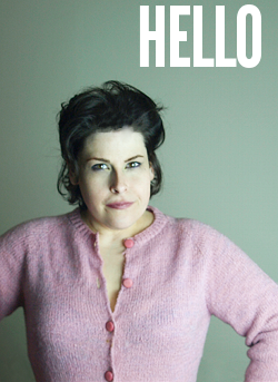
Lori Boothroyd
Wellness Coach Lori Boothroyd had a beautiful site, but there were some drawbacks. It was frustrating to make changes to individual web pages and next to impossible to make changes to the design itself.
She had outgrown the old site’s tag line, but wasn’t able to change it easily. She felt the “Subscribe NOW!!!” language on her banner was too pushy for her audience. It was also important to her to be able to add new features like audio (using Audio Acrobat). All of this was impossible with her old site.
So, we came in, made the changes she wanted, and coded the site for WordPress. This gave her an easy-to-use admin system and updates are now much easier to make. What’s more, the site is search-engine friendly, the navigation is streamlined, and she’s saving herself both time *and* money (the old admin system was a monthly expense; WordPress is free).
The entire process took about a month, and ultimately meant that Lori had a great site that she’s really comfortable updating.
Visit Lori’s site and see for yourself.… Keep reading
King Medical Systems
When King Medical Systems decided they wanted to move beyond the default Constant Contact HTML email newsletter template, they came to us. They needed a newsletter design that their readers would love that could be filled with high-value content. They also wanted to be able to feature several products in each issue so that the newsletter could directly increase their sales.
The final HTML email newsletter template makes use of elements designed to grow their list and sell product. It’s a conversational newsletter that includes Paul’s own personal touches throughout (like shared jokes or YouTube videos) and that helps readers feel apart of the community the company is building for their customers.… Keep reading
Sheira Mackenzie
Mortgage Maven Sheira Mackenzie was ready to launch an email newsletter to keep in touch with her clients and referrals. She wanted an HTML email newsletter template design that would appeal to high-end buyers and remind her clients that she’s available as an on-going (and trained) financial strategy consultant.
She uses the HTML email newsletter to connect with current clients and guide them as they make financial decisions. Because Sheira has additional financial planner training, she’s well-poised to guide her clients through the myriad of financial changes they experience throughout their cycle of home ownership, and the HTML email newsletter is a key component of this overall brand.
From the very first issue, her readers have responded really positively–especially appreciating the way she brings her encouraging (but never Polly Anna) approach to letting clients know how financial forecasts are likely to impact their home values.… Keep reading
Karen Field
Karen Field was in the market for a professional website design so she could launch a serious business site. She planned to use this website to provide her clients with new content, promote her products, and grow her newsletter list. She needed the site to be easy-to-update so that she could make updates regularly on her own, and she also wanted the site to help her rank in the search engines.
As a coach, Karen specializes in working with individuals who grapple with anxiety, and so it was important that the site not be cluttered or overwhelming. She wanted it to be made clear from the website design itself that she was easy to work with and took a gentle approach with her clients. She also had a photo that her husband (a professional artist) had taken of a butterfly that she wanted incorporated into the design.
It was important to Karen that visitors feel like they were getting to know her better, so we imbued the site with her friendly, warm personality. We added her headshot to the design, along with a brief bio (with a link to more information). All of this was designed to help people know more about her before they got in touch.… Keep reading
Newsletters in Focus
Newsletter archive website, we designed the two-column layout to offer both advertising for sale (directly from the site publisher) and to run Google ads. Site is updated weekly and makes use of several excellent plugins and decorative drop cap functionality.
The site is popular with readers and advertisers alike. Though in many ways the site is a traditional WordPress blog, comments are nearly always closed at this site. That serves two purposes for the publisher–the first is that it routes all comments through email which is easier (for some people) to manage. The second purpose is that it ensures that when comments *are* opened, there are typically more of them which really facilitates conversation among readers. When comments are always open, business blogs sometimes find that community-building impact diluted over the entire blog instead of concentrated on certain posts.… Keep reading
Helaine Smith
Helaine Smith came to us when she wanted to start an HTML email newsletter. She needed a sophisticated, straightforward template to represent her high-end dentistry practice.
Helaine leads her field as one of only 2% of dentists in the nation providing full-mouth reconstruction (so, if you’re looking for a dentist in the Boston area, you know where to go…), and it was especially important to her to find a company that would handle her email marketing as professionally as possible. We continue to work with her on each newsletter and also create her regular online archives.… Keep reading
Yummylicious
Lisa Evans had purchased a blog theme (from another company) but she wasn’t quite happy with it and wanted some customizations.
She contacted us to make the look of the template her own. One thing she knew was that she wanted to include a photo of herself in the header, so we tried out several different photos she sent us until she decided on the one she liked best. We also created an entire custom header for her, selecting a font that captured the essence of her Yummylicious brand. We created a new color scheme for her, changed the navigation to make it better suit her needs, and integrated her new brand throughout the blog.
Please note, due to a new book title, Lisa is no longer using the Yummylicious name.… Keep reading
The Brand Dame
The Brand Dame is Lyn Chamberlin’s branding blog built in WordPress. She connects with readers on a regular basis delivering news related to personal and professional branding.
Lyn wanted an unique illustrated header, so we worked with the illustrator of her choice to have something she absolutely loved created. She also wanted to make good use of social networking and bookmarking along with Twitter, and Flickr, all of which found a place on her website through WordPress plugins.
The site isn’t based on a pre-existing WordPress template so Lyn can be assured that her blog and header are both one-of-a-kind.
Read what Lyn had to say about working with us.… Keep reading
skyePR.com
Brand Dame Lyn Chamberlin needed a new identity. She was ready for a professional website, blog, and email newsletter design–and that’s exactly what we gave her.
The new skyePR.com site makes use of her brown and orange color scheme and provides a fresh, clean showcase for her branding work. Using an event calendar plugin, Lyn’s able to easily deliver an up-to-date speaking event calendar to her website visitors. The site also generates an updated, random list of posts from her blog to ensure there’s up-to-the-minute content for her website visitors.
The site also reinforces the design we developed for both her email newsletter and blog–creating an integrated online identity for Lyn Chamberlin and skyePR.
Read what Lyn had to say about working with us
Like the cobbler children who have no shoes, I realized that I had outgrown my brand. Here I am, being sought after as an expert in marketing and my number one piece of web real estate no longer reflected my business or who I have evolved into as a professional services provider.
GNE Journal
One column theme designed in WordPress. Made extensive use of plugins to protect against spam and to facilitate commenting and social bookmarking. Site made several thousand dollars in sales in the 30 days that it was active (with about 100 readers).
The site was very popular with readers and often had 10+ comments per post.
Lessons learned from project include: 50/50 advertising content mix will seem like too much to some readers, but won’t bother others. Daily updates isn’t too frequent as long as you make good use of stories. Having multiple products to sell saves posts from being overly repetitive. Live products (teleclasses, seminars, etc) are an easier sell than pre-existing products (books, reports, class audio recordings).
Site was designed for a 30-day project and is no longer active.… Keep reading