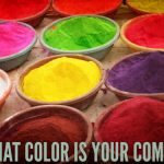


How to Use Your Sense of Style to Find Your Web Colors
By Jessica Albon
Your Brand Siren can offer a road map on everything from your website design to how to write your content marketing. What you might not have realized was that it can also point you in the right direction of the brand design details, too. For instance, your Brand Siren can point the way to the right color scheme for your marketing materials.
Find your Siren below to see what it means for the colors you use.
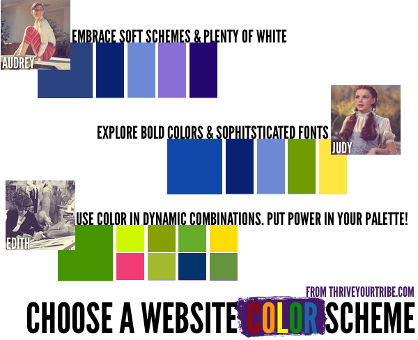
Edith Head
The Edith Head brand is marked by calculated risks. This means stepping outside traditional website design color schemes, using super saturated colors, and setting the tone by choosing colors that expand on what you’re saying. You can get away with more colors than most people can (typically, a good color scheme uses no more than 3-5 colors), but you also might decide to choose a less colorful scheme than others. Whether you choose a two-color scheme, or you decide to unleash 11 colors on your site, the important part is to make sure you know *why* you’re using the colors you are in your brand design.

A couple of schemes to try: black and white (and no accent color), 10 shades of gray plus one accent color (instead of using red which is rather expected, try an orange or teal), orange + red (for a saturated, dynamic look).
Audrey Hepburn
The Audrey brand is marked by classic use of softer colors. You don’t have to use pastels, but stay away from the most vivid colors of the spectrum (red and orange tend to be too “hot” for your site). Stick to the traditional 3-5 color scheme, but feel free to freshen it by using a monochromatic plus one analogous color (touching on the color wheel) for subtle interest. It’s important, too, to add plenty of space for the eye to rest–usually, that means plenty of literal white space.

A couple of schemes to try: two shades of blue plus purple, four shades of blue plus teal, three shades of purple plus two shades of blue.
Judy Garland
Judy’s colors are fresh and vibrant, but not quite as daring as Edith’s. Sunny, cheerful colors are a perfect accent for this brand design, and using them in a playful way ensures you’re maximizing Tribe appeal. Use caution, though, because your propensity for primary colors can make your site too childlike (which really only works if you care for children). Bring an edge of sophistication with plenty of white space, and classic, clean fonts. (Attention Judys of the world: DO NOT use Comic Sans. Or Papyrus. Please.)

A couple of schemes to try: yellow plus blue evokes a sunny day, green plus blue is fresh and natural but slightly more sophisticated.
Next time, we’ll cover the remaining types, and in the meantime, make sure to take the Brand Siren Quiz.