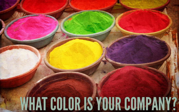
What Color is Your Company?
By Jessica Albon
In the little seaside town where I have a beach house, there are 6 or 7 major real estate offices and one of them has done a great job branding the color yellow. Locals know when you see a yellow sign in front of a house, it’s listed by this particular agency.
And yet, in every issue of the local “Homes” magazine, at least one other real estate agency tries splashing yellow all over their ad. Sure, it’s a beach community and they want their ads to look bright and sunny.
But when I see yellow, I’m thinking of the real estate company that’s already got it branded. And, since this company uses yellow all over their signs, that pricey ad is doing a more effective job making home buyers watch for those yellow signs than for the advertising agent’s signs.
Of all the pieces of your online platform, your email newsletter is a particularly good opportunity to brand your business. That’s because it shows up in readers’ inboxes again and again, reminding them of who you are and what that looks like.
That means your newsletter offers prime real estate to focus on your company’s color, whether that color is orange or aquamarine.
But something people struggle with is how much is too much, where do you put that color exactly? Of course, that depends on the color itself and your overall design, but here are the most likely spots:
- The nameplate
- Headlines
- Pull quotes (when you pull out a piece of text to highlight it)
- Borders
- Bullets
- Photos (whenever possible, use photos that emphasize your color–for instance, can you wear it in your editor’s photo?)
- Sidebars
- Backgrounds
- End marks (that little image at the end of an article)
- Drop caps
- Links
Today take a look at your newsletter and consider it in light of your company colors (and your competitor’s colors). If I were to take a look at it, would I think of you or your competition?
If you and your competition use a similar color (blues are popular with consultants, for example) you can either change your company color (a good idea if your color was selected without a lot of thought), or stake your claim on the color.
If you want to stake your claim on a color that’s popular in your industry, here are some ways to do it:
- Get Super Bold. Use the color at full strength on everything. Use it as the background color on your business cards, use it as a backdrop when you have photos taken, paint your company’s building in your color, etc. If you’re using a color that’s already popular with your competition, you have to use it in high-impact ways to stand out.
- Make it Pop. One way to make a color really pop is to use it against its compliment. By using the color that’s opposite your color on the color wheel (blue and orange, for instance), your company’s color will stand out more.
- Make it Punny. If you use a color or color scheme that’s already common (like our black and white and red color scheme), consider ways to tie it in to your brand with something memorable, like a pun or joke. For instance, at DesignDoodles.com, I used the tagline, “Newsletters that are black and white and *read* all over” after the popular joke with a million punch lines.
Your Turn:
Take a look at your newsletter and count how many colors you use–might any of them be associated with your competition? And which of those colors is most strongly “yours”? How can you amp up the connection your readers make between your company and that color?


